What are the key design elements of Patrick Bateman’s business card and how can they be used to create an impactful business card for my business?
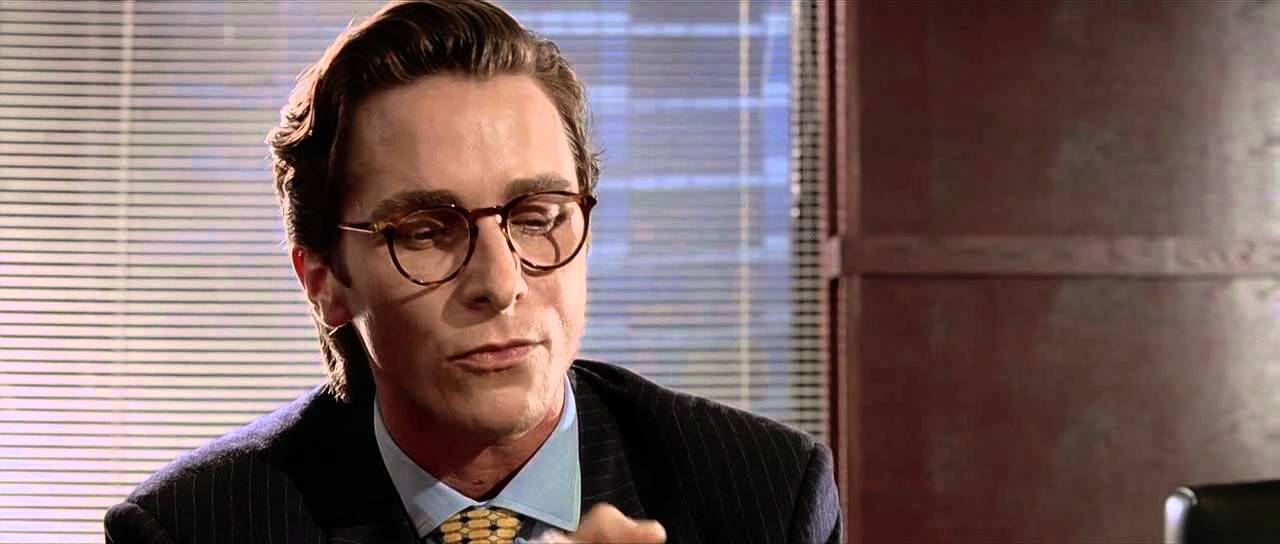
In the 2000 film American Psycho, the main character Patrick Bateman strove for ultimate perfection in his life. From his wardrobe to his business cards, he was careful in making sure everything he presented himself with was of top-notch quality and oozed with sophistication and style.
Though it may seem basic, his infamous business card has some key elements that will help create a memorable and sophisticated look for your own small business. Let’s take a look at what makes up this iconic design and how you can incorporate these same elements to create a powerful and eye-catching card.
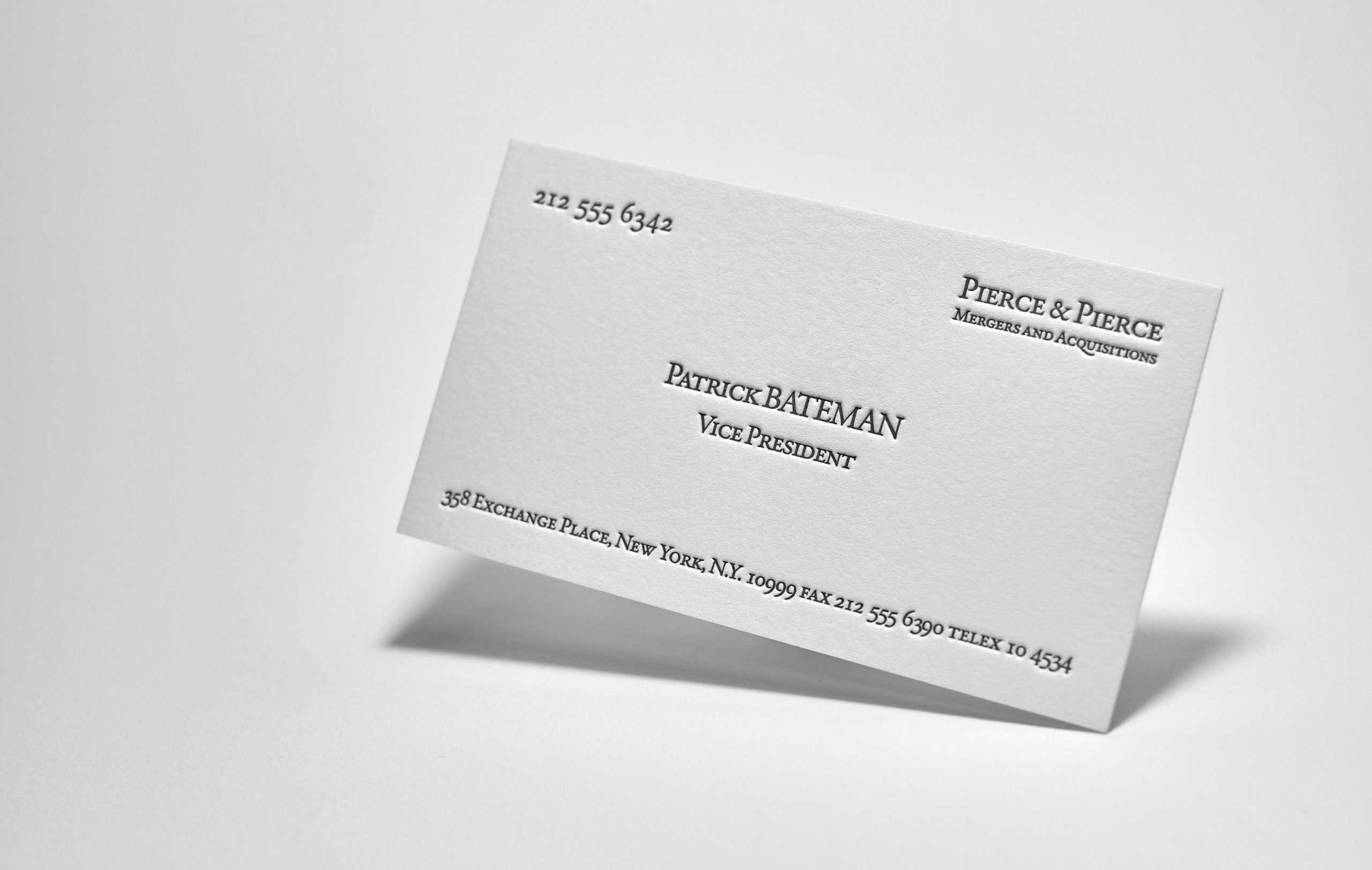
Business Card Layout and White Space
The layout is very well thought out. The most important elements – name and title – are at the very center of the business card. In the top right-hand corner, which is also very important for the card, is the company name. The fax, telefax, address, and other less important information are at the bottom of the business card. In the top left corner is the telephone number. Please note there is only one phone number. He could put fax and telefax numbers next to the phone number, but Patrick was a perfectionist, he put only phone number in top left corner of the business card so that it would be clearly noticeable and just in the right place.
One of the most crucial elements of Patrick Bateman’s business cards is their fantastic use of white space. Generally, more white space is better when designing a business card—keep text succinct and eliminate any superfluous flourishes or designs. This provides a crisp, sophisticated look that properly showcases the relevant information in easy-to-read sections.
A Clean Typeface
In addition to adequate white space, another essential element on Bateman’s card is the clean typeface used throughout. Business card designed by using a serif font called “Silian Rail”, which, I’m sure, was created a long time after this movie premiere. The actual typeface which appears in the movie could be one from the “Garamond” family. Garamond is a family of many typefaces derived from the work of Claude Garamond, a 16th-century French engraver. Garamond is still widely admired today, having remained a timeless, classic favorite across centuries. The simplicity and legibility are part of why his cards have made such an impression throughout the decades. When creating your own design, try using one or two fonts, rather than overloading it with multiple different typefaces in order to achieve consistency throughout all information on the card.
Elegantly Scripted Logo
Another critical design aspect employed on Patrick Bateman’s cards is his logo — the company name applied with an elegant serif font that perfectly complements the other simple typography found on his card. Oh, by the way, did you notice that the logotype on Bateman’s card is written incorrectly, there isn’t a space between the ampersand and “Pierce”. Today, many companies offer custom logo design services which make it easier than ever for your business’ font to have its own unique flair while still maintaining a level of consistency among printed materials like your business stationery. But if you are self-employed, for example just started a lawyer or private medical care practice, and you thing that you don’t need any special logo at this stage, you can do it by yourself. Would be a great idea to have the company name simply written just in a nice typeface, similar to Patrick’s Bateman business card style.
Colors, Paper, and Printing Technique
Last but not least, when assessing Patrick’s cards remember to keep color minimalistic — while gold foil is appealing, there’s something timeless about a professional black-and-white combination used strategically throughout your layout which can add sophistication without overwhelming your reader with bright colors or patterns.
In the movie, we can hear that Patrick’s card was printed on paper of a “bone” shade. The paper itself with its thickness, color and surface texture looks very similar to our 430 gsm pure cotton paper. And clearly appears that all elements on the business card are printed with the impression what means that it’s definitely a letterpress business card.
We’ve decided to create our own Patrick Bateman card version, which would be possible to use as a template for all who would like to have a similar business card printed in the same technique on similar paper.


